


Looking for the perfect green that has a tinge of blue to it? This could be your solution!


We all know black walls are all the rage right now but if you don't want it so dark? Try "Almost Black" it has enough gray to make it bright!
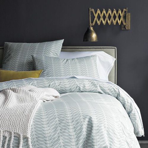
Do you like this idea of furniture companies pairing with paint companies? Is it helpful for you?
**Note: As you can see above the paint chip sample online looks different than what is in the actual room photo. When choosing paint for your own home never go by what you see online, the color will always be a tad different. I suggest picking up a small paint sample at the store and paint a color swatch in the actual room, than you will never be disappointed!
**Note: As you can see above the paint chip sample online looks different than what is in the actual room photo. When choosing paint for your own home never go by what you see online, the color will always be a tad different. I suggest picking up a small paint sample at the store and paint a color swatch in the actual room, than you will never be disappointed!
(images from West Elm)


13 comments:
Love those, especially the gray! The green reminds me of old-school chalkboards...
Love the Almost Black!
Yes, this kind of collaboration is a great thing! And I'm loving the pictures in this post, both these colors are amazing! xo
Such a smart idea! I'm always wondering what colors they use!
Love this. Don't know why more home-decor companies don't pair up with paint companies. Perfect combo.
LOVE BM's "almost black" ! Just about to do my bathroom in it! Natch I'll blog about it .. hahaha ...
I love the green! And that is such a great idea. sounds really helpful.
I actually liked the color combos they put together for this season. I think all the colors are really pretty and they work well with all of West Elm's new line. Which, of course, is the point :)
I adore the grey so much... I think it's an interesting concept -- pairing with painting companies, as a lot of people cannot visualize finishing a room with pieces, and the right wall color. I think this will be delightfully helpful, and boost sales!
Hope you're having a great week, lovely lady... can you believe that tomorrow is Friday?
xo
I concur with the other comments, love the pairing of companies and love the Almost Black.
Not only do I agree about painting a swatch on a wall, I think if you're doing an entire room in one color, you should do the swatch on each wall in order to really observe how the light affects things.
Love that deep green paint color. I think that paint companys pairing with furniture companies is a great idea and especially helpful to people who do not have the natural design instincts. I think a lot of people will love this trend.
It makes total sense to me - great promotion for the paint companies who don't normally put out catalogs.
Side note - any idea where to get a scone/mounted lamp like that AMAZING one? As far as I can tell it's not a WE product, but I have that page torn out of my catalog, I love it so much!
YAY so glad you all enjoyed this post! It is exactly the reason I started the "Color Time" series. For me it is helpful to show clients the paint in a room setting!
Maggie - Restoration Hardware has a similar mounted lamp! Shades of Light has one as well!
Post a Comment