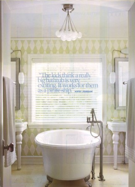
Flipping through my Mom's Better Homes and Gardens I came across this sweet bathroom. I loved the serenity of it but what truly caught my attention was the lighting fixture.
Of course I went on the hunt to find the source, Shades of Light along with specifics. While doing this I learned a great lesson. The photo of the Spun Glass Sphere Chandelier on their website did not represent what I loved from the lighting in the room. It didn't have the same crisp bulb or light weight feeling which is what I was drawn to in the first place. Now I know there are stylist and lighting tricks for photo shoots but I think you get what I am saying!
Subscribe to:
Post Comments (Atom)


5 comments:
I agree with your sentiments! Though, I love the concept of the chandelier I almost wish the cluster were less symmetrical. More visual appeal as I look up from the tub is always a plus:-)
Love that light fixture so fun to have different than the norm!
You're so right. That light fixture caught my attention too. I haven't quite have the time lately for home inspirations and i am definitely enjoying yours!
So true. I loved visiting the Parker hotel in Palm Springs but it was hard for it to live up to its beautifully styled photos. Every little pillow that wasn't fluffed didn't quite look right because of my skewed perception of what the hotel was "supposed" to be like. I had to take a step back and remind myself that nothing looks as good as it does "in the magazines."
Nice find! What an elegant, cool and chic light fixture this is...not to mention that the whole bathroom is pretty -- that tub is so luxurious :)
Post a Comment