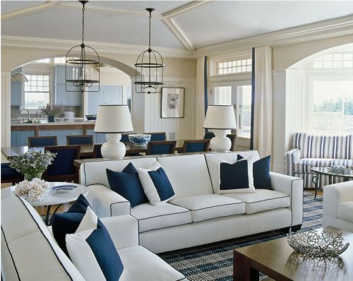
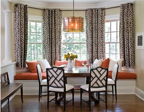
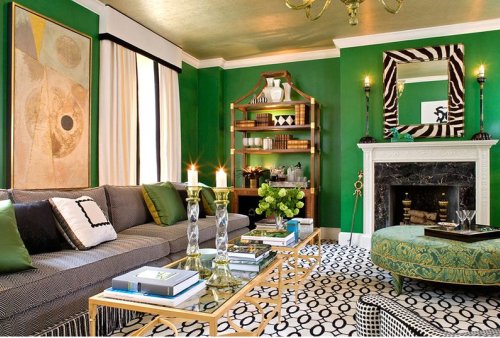
"Her designs start with the architecture and develop based on the clients' interests and lifestyle. While offering a range of choices, the interiors are generally based on a clean, traditional style with distinctive objects and details."
As you can see in these photos the base of her designs start with a solid color or fabric which than lets the one or 2 strong patterns in the room really take center stage!
That wallpaper says it all and is just the right amount of pattern for this space!
Could this room be any calmer? I love the idea of sticking to a 2 color scheme!
As you can see the colors don't necessarily need to be a neutral to get this same look you can work with a bright green and throw some Zebra pattern in for that wow affect!
Hop over to Sherril's website, I am sure you will be just as inspired as I am!
(images from Sherrill Canet)
(images from Sherrill Canet)


6 comments:
Wow, you're right...her rooms are stunning!! I especially love the first family room with all that light. The dining room is awesome, too, with the contrast of the geometric table and more organic wallpaper. Thanks for sharing!
I love the blue and white room, seems as it would be located on waterfront! Simple color palettes are calming.
thanks for the comments ladies! Amy I think I am resisting fall a bit because the blue and white room is my favorite too!
you know I love the 2 colour scheme as well -and i think it works best with blues or greens.. but it takes major commitment..
this gallery is lovely ...
Vie
I must agree with you. Actually, every single room you have featured fits with my lifestyle and taste. Very nice!
What a wonderful designer! I am in love with her colour palettes. So calm and welcoming.
Thanks so much for the link to her website - truely inspiring work!
*bisous*
Dane
Post a Comment