What are your thoughts? Do you like oversized wall decor? Would you use it in your own house?
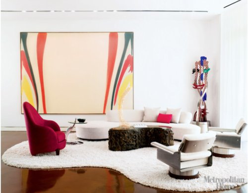
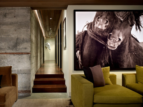
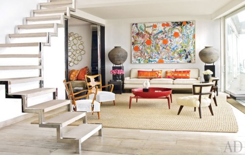
(images from 1. Elle Decor Painting by Morris Luis 2. Garrett Cord Werner Art Work by Dutesco Art 3.Architectural Digest painting by Nancy Graves)


 Welcome to CreateGirl, the Jace Interiors blog! Grab a cup of tea and let's meet at the kitchen table. I hope you will find this a blog of inspiration and tips to use in your home. Friends and clients are always asking me where to find certain home items at affordable easy to buy places. Here is where I will share all of those finds I have scouted for! Thanks for reading & feel free to send an email if you are in need of design help - julieann@jaceinteriors.com! Enjoy!


7 comments:
I love it!
There are so many loft apartments in the city that having an oversized piece of art like the ones you pictured here would be perfect!
I LOVE oversized wall art. I love to make it, I love to sell it, I love to hang it in my own space. I'm frankly a bit obsessed :-)
I think it's an amazing solution for apartment dwellers -- I've had my fair share of run-down walls in Boston and covering them up with huge artwork has always been my #1 solution!
I also am loving the larger than life art. Try talking some clients into this is not so easy though.
LOVE this look but agree - you need to really be careful about proportion, scale and color. Consumers beware - I think it takes a designer to pull it all together successfully - the idea should come with a bubble saying "Don't try this at home"
I am not a designer and I rarely comment (I tend to "talk" too much!). I just had to speak up today to say how much I have enjoyed your thought provoking choices, which I pondered with pleasure over lunch!
Unless a room is completely self-contained, I find myself distracted from even the boldest piece, or overwhelmed by the whole mix, if the views into/from adjacent spaces have not been considered as well--their architectural elements, surface materials and artwork, not to mention the colors used.
I enjoyed the interior in your first choice as an exciting balance of surface texture as well as color, effectively framed by the merest negative space at ceiling and floor. The surprise for me was the "adjacent space" revealed in the mirror image of the room exposed in that fabulously glossy floor!
In your second photo, I found the bold Dutesco Art piece to be balanced on a basic level by the granite wall. Visually exciting, I thought, was the way my eye was "pulled," via negative space, surface material and brilliant use of light/shadow, down the hallway to the thoughtfully-placed equine wall sculpture resting on its "shadow" pedestal-an intelligent thematic complement to the bold piece, a stylistic and visual contrast, and a provocative surprise.
In your third photo, I adore the Nancy Graves painting, but it could easily get into that "shouting match" you speak of with not only the room it is in but the adjacent room and exterior view as well. Instead, it has been thoughtfully complemented by not only the flow of colors into the next room but the thematic echos in the artwork. Keeping three visually busy spaces from running together would seem to me to be the challenge here, but I love how this piece is visually "framed" into its own setting in several ways. Framed by those enormous urns, their complementary pedestals visually ground and connect the piece with the furnishings. Further, architectural framing is effected by not just the metallic surrounds of the entrance to the next room and the window, but by that fabulous staircase, which itself is echoed in those other metallic surfaces.
Great lunchtime fun! Beautiful spaces to ponder. Thanks so much!
Oversized art work looks impressive only in large room. Its always better to keep the artwork and wall decor to minimum and simple if you are having a small room.
Post a Comment