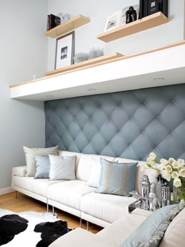
I came across this photo on the BHG website and knew it would be PERFECT for this week's "How To Thursday". Whenever I am hired by a client to work within their "small space" the first thing I ask myself is, are they using their height. Which basically means designing on more than one plain. Using the entire height of a room increases your usable space. It is remarkable how much more you can do when looking up! So let's take a peek at this example:
We start with the cowhide rug and move up to this fantastic sofa which looks to be in pieces, perfect when needing to rearrange. I like that the back of the sofa is not overly high which lets the focus be on the tufted wall, this creates a great stop for your eye as it is not just another "flat" piece of fabric. The use of the deep shelf is perfect for hiding the wiring for the lights. Using lights in this way is brilliant, it doesn't take up floor space or table top space, which both seem to be limited! Than we move our eye up to the decorative shelves that display a few favorite items. Now lets go back to that cowhide area rug, see the black in there? Well they have done this on purpose as it draws your eye from the floor straight UP the wall to those black frames!! A little design trick we use to get you to look where we want you to!
So when you are in a space crunch do yourself a favor and look UP! It's an easy way to maximize your space. Have you designed up a wall in your home? Please share in the comments!
To see how to make the tufted wall click here!
(image from Better Homes and Garden via Kerri Gutekunst)
Subscribe to:
Post Comments (Atom)


4 comments:
Great tip! I was moaning about not having room for anything near the bed (it's not wide enough for a night stand) and then I realized we have lots of wall-space for shelves. Problem solved!
Doesn't it look like two massive frames stacked one on the other? I like this effect both visually and practically.
This was one of my tear sheets too! I love the tufted wall, the shelves, the soffit providing both lighting and making it feel cozy. Plus it's just really chic. I do wish they had a coffee table in the photo though. Feels a tad empty.
Yay I am so glad you all like this space too!
Post a Comment