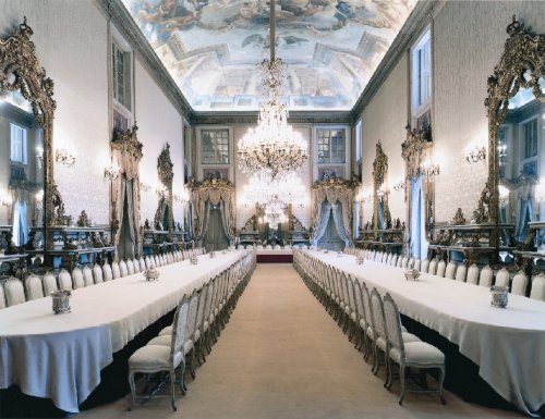
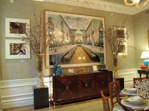
Yes the Biedermeier Chairs are gorgeous and the color palette whispers serenity but it's the wall decor that captures all my attention. In this room I would have to strategically seat myself facing away from the piece as to not be completely distracted by it. The way she photographs her pieces makes one feel like they are actually standing in the space and with this particular room, an enormous sense of calm comes over me. Isn't it amazing when a piece of art can engage all of your senses?!
Höfer's work has been described as "psychology of social architecture", quite appropriate I would say!
Another touch by the designers I love is that they did not feel the need to mimic the long tables in the art work. The round dining table works perfectly as it moves your eye around the room to include all of its aspects!
(images from Washington Post, Contemporary Forum & StyleBeat)


I would have to agree with you, Julie. Before I read your blog I was drawn to the beautiful art work on the wall. So gorgous!
ReplyDeleteThe ceiling on the second one is so intricate! Reminds me of something we'd see in old European architecture
ReplyDeleteI agree! Joni from Cote de Texas just did a post on this photographer recently with many images. So vivid and arresting.
ReplyDeleteDunes and I were astounded by these photographs when we saw them this week. It was like the room had a fourth dimension. I am so glad to know her name now.
ReplyDeleteThere's another house I just saw in Italian Vogue where the entire wall is a photo from ceiling to baseboards. The effect was amazing. It was as if they had added architecture to an empty box.
The picture was the first thing to catch my attention also. I love the way it give an illusion of a larger space.
ReplyDeletewow, the ceiling on the second image...
ReplyDeleteWhat a cool juxtaposition. That photo is amazing! Have a lovely week, Julie :)
ReplyDeleteThis room would not be complete without this painting. It is a moving piece of art. I came across your post this morning while browsing interior design blogs and your take on interior décor is exquisite. Could you bring in your windows to highlight this painting as well? It is true that you must dress your windows appropriately to bring out their true beauty. Thank you for writing and as a special thanks to you and your readers, I would like to offer a 20% off coupon using this code upon checkout: BLG20.
ReplyDelete