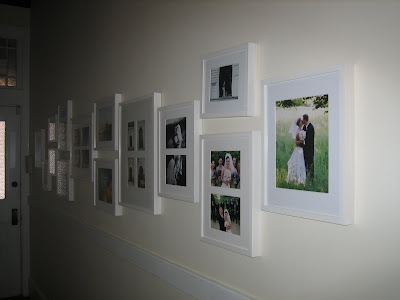
Welcome to another "How To Thursday"! This week I thought we would talk about how to hang a gallery wall. Many of us have a long hallway or a big wall and have family photos you want to display, but how do you begin? Here are a few tips I use when starting.
* Gather all your photos. I like to mix candid photos with scenic photos. They could be postcards, scenes from a vacation or prints you buy from Etsy. If you have children why not mix in some of their art work?
* Decide on the size frames you need. If possible I like to pick 3 sizes to mix together.
* Depending on the house style you could use all the same colored frame like we have below or you can use tones of the same color or style. If you have time, collecting vintage frames from flea markets can make a unique gallery too. The key is to have one thing that connects all the frames (color, style, texture).

Once you are set to hang your frames decide on the parameters you want to stay in. For example in the photo above we have a chair rail and at the far end I see the molding of the doorway. I chose to stay above the chair rail and hang all frames within the door height, this way you are not "breaking the invisible line" and frames are not "floating".
If you have an open space on the floor below, lay each frame out like you would on the wall. This gives you a sense of the space you have and how close or far apart they can be. It will also give you the opportunity to change your mind and mix the gallery up as you see fit. Do you want all the family photos on one side and the scenic on the other? Are you telling a "story" with a time line?

This is a quick diagram I put together to give you an idea. It's nice to mix horizontal and vertical frames. For example I start on the far left with a vertical frame, mix in 2 more verticals (the bottom and top of the frames meet in the center of the 1st vertical), than 3 horizontals and lastly another vertical. This mix of shapes create an interesting flow. As you can see with the arrows I keep the 1st vertical and last vertical frames the exact same height. The 3 horizontal stays within the height of the 2 vertical frames to the left. This acts like a border to create unity. Also if at all possible try to keep your spacing between each frame the same distance, again this helps with keeping in your border.
You can also arrange the frames so you can add more as time goes on. In this case start in the center of the wall and work out. Most importantly have fun with your gallery and make it a place of great memories!
(images from Jace Interiors)


1 comment:
GREAT How to session!!! Love it! Thank you....I think this is something that everyone wants to do well but it's not easy if you don't follow some basic guidelines. Well done!! :)
Post a Comment