In the Spotlight: Elizabeth Grubaugh at PATCH NYC

As a designer your day is full of running around either on job sites or scouting items for clients but for the last few months I have committed myself to spending one FULL day in the office. Let me just tell you it is heavenly. Not only am I checking items off my list but I am able to take a minute to open interesting promotional emails that come across my screen....instead of you know letting them build up with the hopes that I get back to it someday. Well today I am so happy to have been at my desk as the delightful guys at PATCH NYC just sent out their email blast where I was introduced to a wonderful new artist!

Elizabth Grubaugh's prints are prominently featured in Patch's store for their Open Studio series. I immediately fell in love with her use of bold colors and abstract florals. A bonus is that they are super affordable at $30 each unframed.


This is how Elizabeth describes her process "All my prints start as paintings first. I usually use Japanese sumi ink on water color paper. Then everything gets scanned, and I have fun trying lots of different color combinations."


 "Field of Daisies" is by far my favorite. The subtle hint of soft pink takes the boldness of the print down a notch and in doing so adds a delicate feel.


This is the print that first caught my attention, I love the "Sunshine Flowers" it exudes such happiness and I think it would be perfect in a little girls bedroom. A bit mature but also very fun, a print she could grow up with!


If you are in Boston pop on over to PATCH NYC in the South End to view many more pieces of Elizabeth's artwork. Not local? No worries you can visit her online at Dewey Howard or on Patch NYC website. Now I am off to order a Sunshine Flower for my own office, after all who could not use a little happiness while going through emails?

(images via Patch NYC and Dewey Howard)

Number Your House

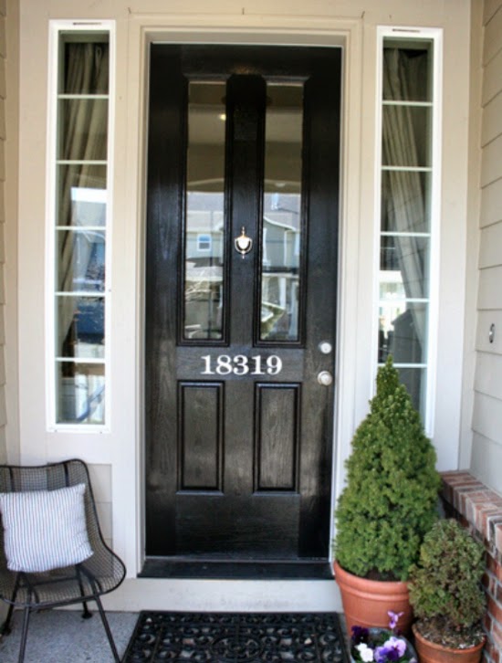
Lately I have been a bit obsessed with front doors, specifically the creative way to number your house! As with the front door color I think the way your house is addressed certainly sets the tone for the feel of the home. Below are just a few favorites I have saved to my "Addition Inspiration" folder over on Pinterest.

As you know I have a serious love of typography and the crisp look of a number written out just seems so regal to me! Our house number is 400 so this might just be the winner for our new door.


Placing your house number in the middle of the door works well if it is more than 3 digits. Anything less might get lost and be hard to see from the street.


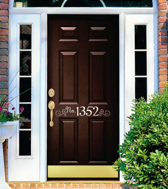
Can we just talk about the great finds on Etsy? This one feels unique but also contained, I would expect this house to be very organized and in order!


The swirl and "No." add to the fun feeling of this home. I also am a BIG BIG fan of kick plates, if you have kids you know exactly what I am talking about. Why does one need to "kick" the door open?


Since my first trip to Italy I have loved the look of ceramic house numbers. This option from Heath Ceramics gives the number a modern feel. They are clean but also have a creative feel to them in the Neutra Font.


What does your house number say about you?


(images via BHG, Jones Design Co, Welcoming Walls, Little Sign Shop, )